MC Brand & Logos
Brand & Logo Standards
Why a Brand is Important
We have created a unified, positive and distinct brand for Merced College that effectively communicates the College’s identity, reputation and values as one of the leading educational institutions of higher learning in the region. Through the proper and consistent placement of the Merced College logo and its affiliated designs, we have the opportunity to communicate to the world messages about what our College stands for. Our visual identity reflects more than artistic designs and thoughtful typestyles; it speaks volumes about our values and image.
Thank you for being part of efforts to develop and communicate our brand. You can find the logo files below, but please read through our branding guidelines first.
Color
Using these primary brand colors clearly connects your program and message to Merced College, building recognition and trust with your audiences.
Primary Colors
These should be the primary colors on everything. The logo should only ever appear in these colors. These colors should make up about 90% of the color usage on any design. Our Blue is our main color PMS 281 and our Gold is the accent color.
- Use the recommended values below for CMYK, HEX, and RGB color spaces to achieve the most desirable gold across print and digital platforms.
- No values other than those listed on this page may be used. Tints and shades of these colors should not be used.
MC Blue
PMS 281
R 0/G 32/B 92
C 100/M 78/Y 0/K 57
HEX #00205CMC Gold
PMS 1245
R 195/G 143/B 0
C 2/M 31/Y 98/K 16
HEX #C38F00
Tints & Shades
These tints and shades are available to provide contrast where appropriate. These should also be used sparingly.
| PMS 282 CMYK 100 72 0 73 HEX #001743 |
PMS 280 CMYK 100 85 0 39 HEX #002976 |
PMS 1235 CMYK 0 25 94 0 HEX #F5B400 |
| PMS 287 CMYK 100 79 0 37 HEX #00328F |
PMS 286 CMYK 100 80 0 12 HEX #003BA9 |
PMS 1225 CMYK 0 16 80 0 HEX #F5C749 |
Secondary Colors
These secondary colors can be used very sparingly to complement our main colors or to differentiate objects like charts or graphs. They should never take up more than 10% of a design.
| PMS 285 R 15 / G 97 / B 216 C 90 / M 47 / Y 0 / K 0 HEX #0F61D8 |
PMS 649 R 213 / G 229 / B 232 C 15 / M 4 / Y 0 / K 0 HEX #D5E5E8 |
PMS 2255 R 157 / G 199 / B 145 C 45 / M 0 / Y 51 / K 0 HEX #9DC791 |
PMS Warm Red R 237 / G 99 / B 72 C 0 / M 83 / Y 81 / K 0 HEX #ED6348 |
Neutral Colors
These tertiary colors can be used as neutral colors in certain compositions.
| Black PMS Black 6 CMYK 78 70 60 75 HEX #181B21 |
Cool Gray PMS Cool Gray 8 CMYK 50 41 41 5 HEX #888888 |
Tan PMS 7527 CMYK 3 5 14 0 HEX #F7F3EB |
Light Gray PMS Cool Gray 1 CMYK 5 4 4 0 HEX #EEEEEE |
Color Usage
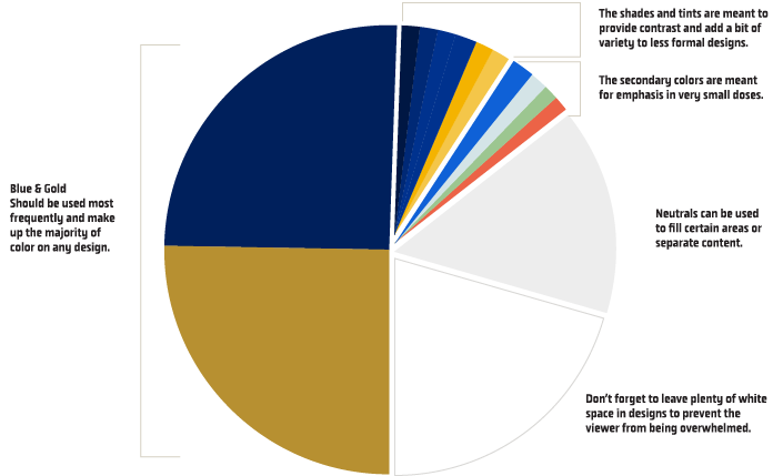
This pie chart, while not scientific, provides a helpful way to understand how much of each color to use in your design.

Typefaces & Fonts
Type is the heart of any brand. To ensure the cohesiveness of our branding stick with these officially selected typefaces.
Montserrat
Montserrat is a thick heavy font mainly used as a headline or display text on promotional materials.

Spectral
Spectral is a classy looking serif font for when you need to give a design an extra bit of class and elegance. Use the bold font for headlines. Use it for body copy on more official documents for added gravitas.

Open Sans
Open Sans is a clean, professional and easily acquired font that contains several different weights and italics for use in any situation. This is a main typeface that can be used for body in any material.

Mission Gothic
Mission Gothic is a nice, condensed font with a bit more character than open sans. It’s sparingly used as a simple accent font in certain situations. It is also the font approved for use in our sub-identities. Please contact us if you would like to use this font.

Athletic Typefaces
Obvia
Obvia is our main athletic typeface. It comes in many weights and widths. It works well for headlines and body copy alike.

Logos
The college logo is the core of Merced College's visual identity and must be used in all communications and promotional materials.
Academic Branding
Explore our portal of all the Academic Logos
Spirit Branding
Visit our Spirit Branding portal to get the most up to date versions of our logos for spirit branding and athletics.
Logo Standards
Whenever possible, all materials and communications should be created using the Primary logo in full color. In situations where the Primary logo will not fit because of size constraints, the Secondary logo may be used with preference on using the full color version. View the guidance below on when it is permitted to not use the full color logos and the do’s & don’ts of how to use the logo properly.
One Color & Reversed
While we encourage widespread use of the full-color College logo, we do acknowledge that there are times that one color is your only option. The guidance is to use only white or blue. Reversed logos are meant to be used where the contrast between the logo and the background is optimal such as a blue background.
Official College Seal
 The seal signifies the academic character of the College and is appropriately used in support of official College policies, decisions, ceremonies or other formal actions as an academic institution. To maintain its integrity, the seal may not be used for informal, routine or promotional materials or for materials not directly related to academic purposes without written permission. The seal, in full color or line art, is restricted to, but not required on, the following:
- The Office of the President;
- College-level formal and official documents such as diplomas, academic awards and certificates, transcripts, resolutions and Commencement invitations, College reports
For questions or to submit a request for exception review, please contact the Office of External Relations at [email protected].
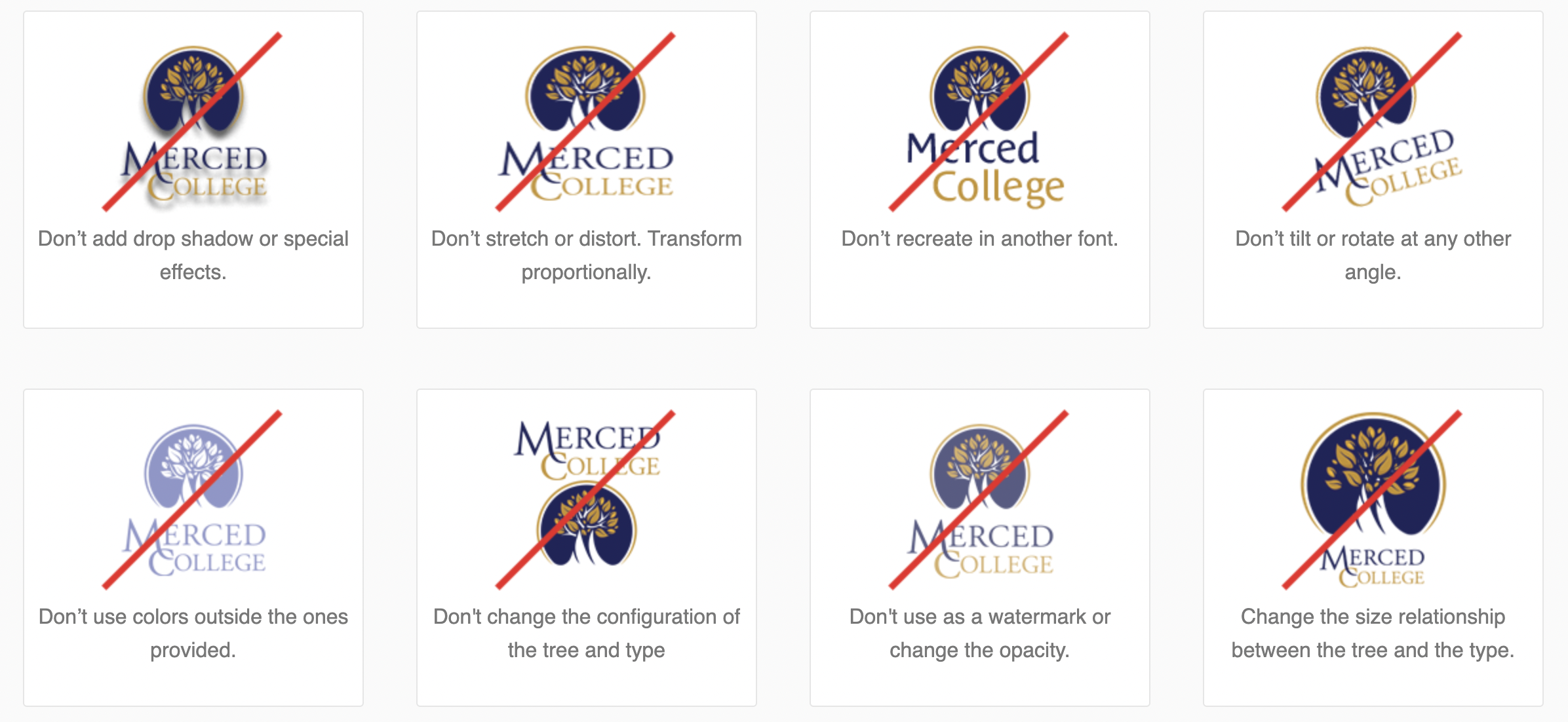
Logo Do’s & Don’ts
 Clear Space
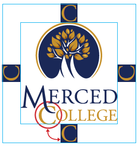
Maintain clear space around logo equal to height of the “C” in the word “College”
Minimum Size
In order to ensure legibility, the logo must not appear smaller than the following dimensions.
- 8 point type
- no less than 150 pixels width

Need help with logos?
-
Anton Boyadjian
Graphics Designer/Communication CoordinatorExternal Relations Mailstop 41
 -
James Leonard
DirectorExternal Relations Mailstop 41